


Steeped in Craft, Grounded in Color
The single-origin series laid the groundwork for MRWST COFFEE’s visual identity, translating the nuances of each coffee into a consistent design language. Geometric patterns and precise typography brought structure to the packaging, while palettes inspired by individual tasting notes gave each origin its own character.
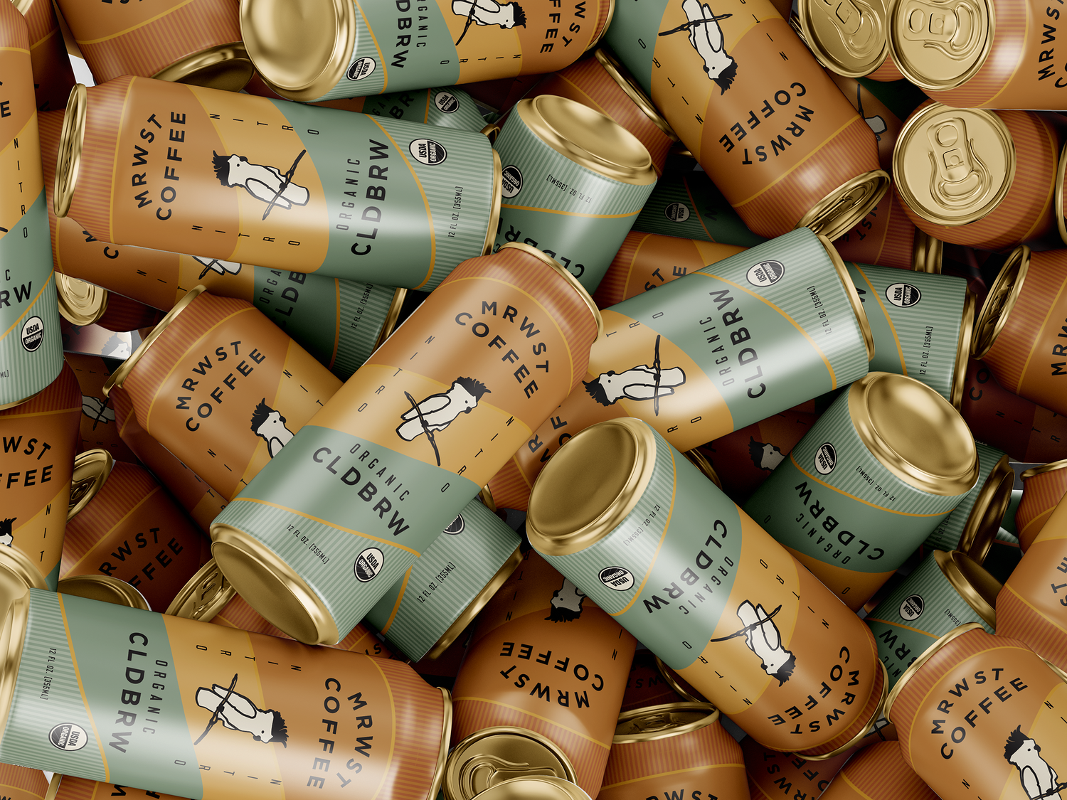
The launch of cold brew brought the brand into grocery retail and marked a new chapter for the packaging system. Its sleek cans established a distinct presence on shelf, while prompting a redesign of the everyday blends to bring the broader lineup into alignment. Updated bags carried the same visual language across formats, creating a more cohesive identity from café counters to grocery shelves.


1.webp)

.webp)